Description
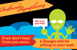
For the Redlands Symphony's 2010 season, they wanted a fun, standout postcard set that reminded subscribers to renew and appealed to new concertgoers.
We worked together to create a clear message and then developed imagery to pop against the standard direct mail fare.
The art style continued the bold, retro punch of the season’s brochure and added a welcome level of playfulness.
We created two versions: one for renewals and one for new subscribers.
Services
- Design
- Copy Editing
- Project Management


