Studies show more than 50 percent of email recipients’ check their email on their phones of tablets. Fifty percent! And even if you don’t trust the folks at Litmus or Moveable Ink, trust your own actions. Consider how often you’re checking your email away from your desktop.
Chances are pretty good most times you see what’s new you’re not sitting in front of monitor. Whether you’re a marketing guru or a business professional, there’s one fact you can agree upon – you want your recipients to read your email.
Do you care if they’re reading it on a desktop or a tablet? No. You just want them to read it. This is why mobile friendly email is essential. Utilize these tips to ensure your email arrives in a format all your prospects and clients can read.
Short Subject Lines
Subject lines are the first step to getting your emails opened. They either grab your recipients’ attention or lose it. Phones, tablets and even desktop computers only display a certain number of your subject line’s characters. If you write too long of a subject line, it will be cut off.
This can pose a serious problem. Depending on where the break happens, your subject line might not make sense or imply something completely different than you intended.
By keeping your subject lines short, you avoid any of these potential hiccups. Typically, this means keeping your subject line to 40 characters or less.
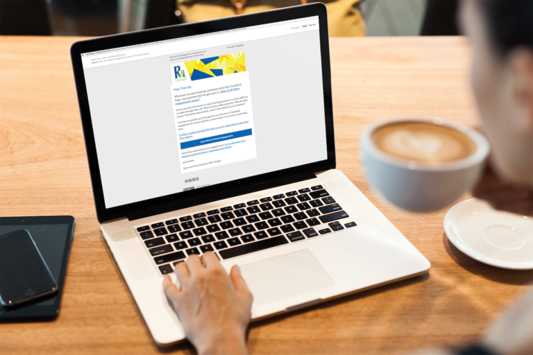
Responsive Email Templates
Similar to web designs, the best way to create mobile friendly emails is with a responsive email template. This will allow you to draft one email that will scale to the appropriate proportions depending on the recipient’s device.
Email service providers, such a Campaign Monitor, offer excellent responsive templates.
Single-Column Templates
Mobile devices really need single-column layouts for email. If you’re using a responsive email template, your service provider will take care of this. If you are not, make sure you only use one column... unless you really, really, really test your layout :)
Large Fonts
Small fonts make people squint. They are hard to read and in some cases, impossible. Don’t use them. Instead, use a font size of 14 or 16 pixels. This will make your email reader friendly across multiple devices.
Clear Call-to-Action
What’s the goal of your email? What do you want your recipients to do? Tell them. Make it clear and easy.
Make your call-to-action it’s own distinct line. Make it a different color. (This is pretty easy if you’re creating a hyperlink.) And, make it big enough that it’s easy to click.
Don’t make your call-to-action an image. Some recipients only display images from verified email addresses and some recipients don’t display them at all. If you’re recipient doesn’t have images enabled, they won’t see your call-to-action.
TEST
As with all aspects of the Internet, testing is imperative. Before you send your email to all your recipients, draft a test version to yourself. Check how it appears on multiple different devices including: tablets, smartphones and desktop computers.
Have additional questions about creating mobile friendly email? Contact us today.