UPDATE: We're excited to announce the Journal's now responsive!
Confession: If you’re reading this post on your smartphone, you’ll have noticed the RWL Design website isn’t responsive. Why are we behind? Because last year we were focused on our clients and getting their sites up to speed. Now it’s time to also update our site. There’ll be some changes in the coming months. Until then, we’ll have to keep looking a little silly with our unresponsive selves.
Growing up, only old people used the saying, “I remember when.” Now, technology is changing so rapidly not having the saying in your vocabulary is nearly impossible. One of the best things about working with Ryan Lonac, President of RWL Design, is his commitment to studying the latest technologies, learning about how they work and using them effectively to benefit our clients.
The other day we sat down and talked a little shop. Check out what Ryan had to say:
Mikaela – There’s a lot of talk about responsive websites. Are they really that important?
Ryan – Without a doubt. Back in the day, we created websites very differently. There wasn’t page zooming, fonts size could break the page, everyone debated pixels vs. em’s, and there were generally constant screen sizes and page widths. Today, people access your content across a myriad devices with different screen sizes and functionalities. Responsive designs and modern web technologies have made great strides to help even out the experience across browsers and devices - making it possible to put your content first and make it accessible however people view it.
Mikaela – What’s a website design with fixed screen width?
Ryan – Fixed screen width website design is are how the industry used to build websites. It was a lot like painting a picture. You could meet with a client, get their feedback, research competitors, get user feedback if you were lucky, and prototype a concept that was pretty much what their website would look like.
Mikaela – How is a responsive website design different?
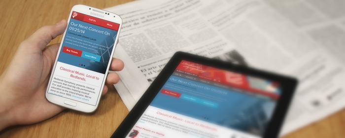
Ryan – A responsive website responds to its environment. Developing a website based on a fixed screen width assumes all the users accessing your site will do so through the same kind of device – typically a desktop computer or laptop.
That’s just not the case anymore. Users surf the web on their smartphones, tablets, laptops, TVs and desktops. To maximize user experience, each device needs display the content accordingly and account for each device’s capability. For example, visual feedback was always given when a desktop or laptop user hovered a cursor over a button - it would change color or some other spiffy effect. A touch device doesn’t really offer that. You have to think about the user and how will he or she access the site. Responsive websites recognize this and offer tools to give appropriate feedback.
Mikaela – How is the design process different when you’re designing a responsive website?
Ryan – When you’re designing a fixed screen width website, you could show clients a relatively accurate version of what their website would look like from the very beginning. You can’t do that with responsive designs. Creating them is a process. They have to be built out and tested. You still need to sketch, but prototyping has moved to the browser. Iteration is key.
It is a larger task for sure, but one worth doing.
Development firms have to consider the capability of each device. They need to consider the overall footprint of the site (aka how much data is being sent). They need to think about the images that will load and test how those images will look on different devices. How does the navigation stay relevant? How do users submit forms? Do you need to add features on different device?
One thing Responsive Design is not: a silver bullet.
You can still make sites dedicated to specific devices, but I think the technology has reached the point where it makes sense to consider one site that has a better chance of reaching users across any device. There are just too many devices now to target them individually and that will only continue to be the case with new devices like Google Glass and smart watches. People will want to read your content on their time with the devices they have.
Some companies offer a mix: Responsive sites that give way to device specific experiences be it native apps or web apps.
One thing that has not changed, though, is making sure you are focusing on your target audience. Modern user experience / interaction design and responsive design just give you tools to do that better. Maybe your responsive site doesn't need to target every screen size or device. It depends on what you offer and who needs to access it.
Actually, Patrick Neeman is a likeminded local. He just wrote a great piece about differences between responsive, adaptive and native sites.
Mikaela – What does RWL Design do to check website designs throughout the design process?
Ryan – We test the website on multiple devices including tablets, laptops, smartphones and TVs. I even use my Xbox. When we can’t access devices directly, we use virtual versions to do basic tests.
User panels are great, but only for getting future requests. Small groups of users testing specific tasks give you better data on whether the design and functionality are working.
What revolutionary new responsive design techniques has Ryan used to help our clients as of late? Check back next week when we’ll discuss one of the latest design features he’s implemented.